

Colour People Interview
Martin Minde, Colour Art
Martin Minde (born 1940 in Königsberg) first worked as a painter and restorer after his school years. He completed his subsequent studies in fine arts as a master student. Since 1973 he has been working as a freelance artist and gives numerous lectures at home and abroad.
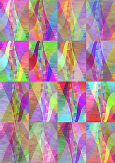
He has developed his own „colour form theory“, a huge work on the uniformity of colour nuances, from which impressive works emerge. Many are created as computer graphics - here, instead of using the usual algorithms for colour variation, Minde has programmed his own rules. Minde creates other works in oil.
Minde lives in Munich.

Questions for Martin Minde
Mr Minde, what excites you so much about colour, what drives you?
If, after forty years of almost exclusive occupation with colour, one can still discover something essentially new, it must simply amaze one, indeed lead one to wonder at all that the Creator has placed in our sense of sight.
What formative experience do you associate with colour?
My encounter with Vincent Van Gogh via - I have to laugh when I think about it - an art postcard of one of his self-portraits, which I wrote a description of as a homework assignment, was of decisive importance for my choice of career.
The fact that I was later lucky enough to have Reimer Jochims and Meyer-Speer as my teachers paved the way for realisation. Incidentally, Reimer Jochims became my highly esteemed initial spark when he threw me out with the angry words that I was „stupid“ when I showed him what I thought were my first significant pictures after my studies. No, he probably wanted me to understand that I didn't need the praise of an authority figure, but could learn to walk on my own two feet.
What is your favourite colour and why?
My favourite colour is the designed one. I associate it with the unity of form and colour in which all visual phenomena are based and acquire their human meaning, especially those that are new to me and for which I am constantly on the lookout.
Unity of form and colour - how is that to be understood?
The unity of colour and form became clear to me in the context of the formation of colour movements, which I executed in resin oil paints: one and the same movement from white to black via neutral intermediate tones could be realised in two ways. Either one worked with an equally spaced gradation of colours in decreasing surface distances, which one then „drove“ into one another, or one applied colours of continuously increasing differences in brightness into a sequence of equally wide surface strips. As I wanted to work with pre-mixed tones that were equally suitable for creating accelerated movements both towards the dark and the light, I chose the first method.
This targeted modulability of colour levels in their compositional mobility is at the same time the cause of a uniformity of colour-body orders demanded by all systematists.

Before I came to form a consistently equidistant system of colour order, I discovered that colours thrown onto the surface at will could be brought into the form of juxtaposition in the picture plane by the way they were connected to each other in special movements. This was only possible because two-dimensional forms with formal relations between the colours (smaller/greater colour distances) could be inseparably brought together in a specific spatial order.
It was surprising to me at the time that a representational content was also convincingly formulated in this way, namely a polychromaticity in which tones of different saturation and brightness appeared in equal harmony on the picture surface.
How did you define the corner points of the homogeneous colour space, how do you define counter-colours, equidistance, colour circle?
As far as equidistance is concerned, it has always been claimed that it cannot be used as a universal principle of colour order. Munsell, for example, orders brightness and chroma according to uniformity in straight steps, but tonal uniformity in a circular order around the neutral axis. In this way, however, he loses the possibility of representing straight connections between colour movements that do not intersect the grey axis in uniformity. This obvious deficiency can be remedied by carrying out the gradations on the brightness-equal planes in two dimensions.
So the principle of the colour wheel is to be abandoned?
Not really. Rather, it is raised to a more general level. Even with dimensional order structure, there are equally spaced surrounding neighbouring colours, but now not only around the neutral axis, but around any colour tone in the colour space. And instead of the straight alignment of evenly structured colour movements only through the neutral axis, there are now those criss-crossing in all directions of the colour space.
And counter colours?
Not only do contrasts that are diametrically opposite to each other with respect to the grey axis form counter colours, but all colours that can be connected to each other via intermediate colours are diametrically opposite colours with respect to their mean value.
How can such a system be realised in practice?
The best working tool for this is our eye. It is capable of recognising both uniformity and alignment of colours with enormous precision.
The simple composition of two adjacent fields in neighbouring colours, whose mean value is entered in small windows in these fields, is suitable as a design scheme for the construction of the homogeneous colour space. They then appear like the swapped surrounding fields, provided that they average between the surrounding colours in an exactly straight path.
The simple scheme for designing straight colour gradations is extended to a field-based scheme in which four colours at the same distance from each other are placed in a square of areas with windows whose colour values appear crosswise like the interchanged surrounding fields when they contain the middle colour of all four colours. A colour space with a uniform, „homogeneous“ structure everywhere can be formed from such building blocks.
When I first tried to realise it, I did not yet know whether this was actually possible. In the meantime, my attempts have convinced me that not only I am capable of it, but that it is inherent as a potency in human beings: Yes, we can!
Do you have a photo of your studio?
Unfortunately, I can't send you a photo of my studio. I even painted my large oil paintings in our flat, which was densely packed with works. Once I dropped a delicately painted picture of the cross that I couldn't quite get past to move to the other room and which was already half dry, which left it with a blemish that couldn't be repaired, but it was still so beautiful that it was later bought by the Protestant church for a bishop. You don't have to despair if something goes wrong - it happens all the time. Even with a few stains on your waistcoat live.
Thank you very much for this interview, Mr Minde.
The questions were asked by Holger Everding.
Further information
...can be found at http://www.farbkunst-minde.de.