
Colour People Interview
"I'm interested in the big questions."
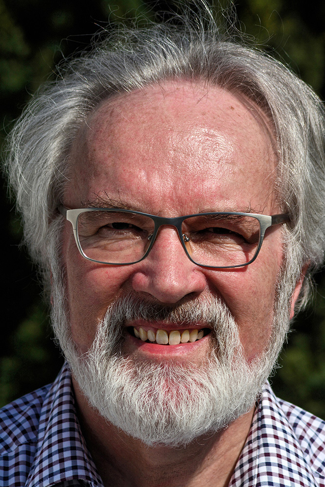
Professor Max Kobbert is a psychologist and taught art didactics and psychology, especially perception psychology, at the Kunstakademie Münster for many years until his retirement in 2009.
His second field of activity as a game designer is better known to the public. "Colomino" and "Bunte Kuh" were written by him, but the best known and most successful is "Das verrückte Labyrinth", which has sold millions of copies in over 80 countries.
A friendly elderly gentleman welcomes the visitor in the cosy atmosphere of his living room, which contains many set pieces of the topics we are discussing. Many proofs and examples of Kobbert's statements can be found on the windowsill, in the showcase with the minerals, ambers and meteorites, and as pictures on the wall.
Attention - reading stretch!
- What percentage of the reality in our heads is actual reality?
- Are colours only an illusion?
- The immediate reality and that of indirect experiences
- How do bees see colours?
- Our colour vision is 20 million years old
- Is my red the same as your red?
- Will we see UV light in the future?
- The future of colour: is our perception of colour dulling or are we learning to appreciate the shades in between?
- What is your favourite colour, Mr Kobbert?
- Does the NCS system have too much green?
- Does the CIELAB model have too little yellow?
- What would be a better colour system?
- How do you see yourself, Mr Kobbert?
- Consciousness, brain research, quantum physics - the major topics of colour
- Free colour, what do you think?
The conversation lasts five hours. Large sections are omitted from the text below; for those that remain, it would be inappropriate to severely abbreviate the thoughts and ideas. It starts right away with the core question of the psychology of perception:
Questions for Max Kobbert
Professor Kobbert, what percentage of the reality we perceive, or of what we think is reality, is actually reality?
If I had to answer very crassly, I would say: almost nothing. Because what we perceive as reality is our own reality, which is related to what you probably mean now, physical reality, but will never be identical to it in any way. If it goes very far, then it is certain relationships and relations, perhaps structures between certain quantities, which have a certain similarity, an equivalence. Psychophysics has been dealing with that for a long time, but it doesn't go beyond that. For example, it does not go into what we would essentially describe as our experience, namely a total of qualities, which is particularly evident in the field of colours.
For me, colours are always the epitome of what happens inside us. This red, this green when I look out of the window here, this wonderfully calming green, this bright red that stands out like a signal, there is no equivalent to it in physics. The wavelength as such says nothing at all. It does not contain any kind of quality, it is an arbitrary point in the total of electromagnetic waves, of which we do not perceive the very greatest part at all.
I once calculated: physically speaking, there are about 80 octaves as respective duplications of wavelengths, and of these 80 octaves that exist in reality, it is not even one octave that finds its correspondence in our experience. Our experience, on the other hand, does not perceive it as a kind of linear section of this linear chain of information, but bends it into a circle, via the purple to the violet and red, and forms a colour circle or a circular structure, which physically does not exist at all.
So, it's a reality all of its own, which is indeed connected to the physical one, otherwise we probably couldn't survive. But it is a reality that is such that we can interact in the world, survive. For the period of our life, we can cope with it, have children, reproduce, all that yes, but no reliable direct statement about this physical world outside ourselves is possible.
We have measuring instruments that are adapted to what physics offers. We measure wavelengths and electrical voltages and everything that is possible. Our experienced world is a world of its own, but it has its value in itself.
Many people nowadays tend to say that it's all an illusion. This is even applied to colours: Colours are illusions, they reflect something to us that does not correspond to reality at all. But this fails to recognise that the first reality we experience, the reality that makes up our world of experience, is our phenomenal reality. The colours, as we experience them, are our primary reality, we cannot dismiss that as an illusion.
It is our immediate access to our world that originates in our head. That we project it outwards, as was claimed in the past, is also a misconception. We perceive ourselves as being inside the world.
That is a paradox. It's very difficult to make someone realise that we don't have the feeling that the world happens or arises in our heads, but we have the feeling: we're sitting here, there's a world around us, the great outdoors, you're sitting opposite me, I can hear myself talking, I can feel my hands and so on...
But one must realise that everything happens within ourselves. Not only the outside world, but also we ourselves have our place within the brain. Both are represented in the brain. All the relations between the environment and us find their correspondence in what the brain does. We perceive ourselves, starting in the prenatal phase, and in the same way we receive signals from the outside world. Our brain makes an overall world out of this, within which we find ourselves at the centre. This is the immediate experience. This phenomenal reality with its colours, with its shapes, with its sizes, with its very emotional qualities - there is no perception without emotional quality - this of course also affects the world of colours, but it affects every object.
We take a position on every object in some way. When we see a chair, it is something to sit on, and it is part of the quality of the chair that it is something to sit on. It's not just the shape, and it's not just the colour, but it's also the function, all of which plays into our experience. The fact that one can sit on it would be very cumbersome to try to grasp physically. It is an overall quality in which a chair presents itself.
So: the world we experience, that is the primary one we experience. Beyond that, there is the reality that we know about because of indirect experiences. The direct experience of the world is, for example: the world is a disc. If you look around here in the North German plains, the world stops somewhere on the horizon, and our primary experience is: the world is a disc.
Until I get the idea that the world could be a sphere, I have to make very indirect observations. For example, as was already done in antiquity, observe: the sailing ship gradually disappears piece by piece in the distance. That's how one came to the conclusion that the whole thing might be curved, but the immediate experience was: the world is a disc.
Now we have two realities: the directly experienced one, which includes the qualities of colour, and the one we know about, the one we infer, the one we measure, for example the wavelength of light. But that is a completely different reality.
We try to understand and relate the two. In scientific terms, or everyone does it for themselves privately, because they realise that there are also optical illusions. Sometimes you have to be careful that you don't make a mistake, that in the dark or at dusk, for example, we no longer recognise the colours as colours. Suddenly everything is grey in grey, suddenly red is something very dark and blue is something very light. These are strange experiences that come with it, but we can also experience this within our world of experience.
In any case, I want to say very clearly: the phenomenal world is our first reality. It is not just any illusion. An illusion can be measured against an actually existing reality. We have no direct access to this reality that is actually claimed, we only access it, and these are pure constructs.
Of course, one can also say that our world of experience is a construct of the brain, but that presupposes that we have a real idea about our brain. That is very indirect, the rat bites its own tail.
But it does work. We can survive and live positively in the world and come to terms with it in mutual exchange because of the things we see, hear, feel and taste. So there's something to that, isn't there?
A wonderful example is indeed our world of colours. The way it appears to us, not just for centuries or since yesterday. We seem to take it for granted that these colours exist, red-yellow-green and all the shades in between. But if you realise that other living beings see colours quite differently, some only see light and dark, some see colours that we don't recognise at all. Bees see ultraviolet, we can't even imagine that, how would that work?
Do you have any idea what is being presented?
We can only translate it. Like a bad translation from one language to another, we can get an idea of what is by trying to translate the wavelength ultraviolet into our visible world, into violet, and for that we delete the red. A bee cannot perceive red as a colour, it perceives red as black. So: the whole spectrum has shifted.
On the other hand, there are creatures like the rattlesnake that can see infrared and receive thermal images. We can't directly imagine that either.
Within the mammals, the primates, one has to say: the world of colours as we experience it today is perhaps only 20 million years old. Before that time, our ancestors perhaps saw in a similar way to humans, who are still red-green blind today. They cannot distinguish between red and green, of which there are many, over 5% of all people are red-green blind. But this way of seeing probably corresponds to the way our ancestors saw about 20 million years ago. They could only distinguish the extremes, the short-wave and the dull lights, in two qualities that are difficult to describe, but which may have been in the blue and orange range.
The ability to differentiate orange into red and yellow and green is a relatively recent achievement of our evolution. This probably has to do with the fact that our distant ancestors were gymnastics in trees, where co-evolution could develop between the ripening fruits and the colour system of the apes. The fruits were in the interest of the plants to eat when they were ripe, then they could be eaten, and all the pulp was a trick of the trees to entice the monkeys to eat the fruits. Through the excretions they then let the trees spread and the monkeys got something out of it.
But they also only got something out of it when the fruit was ripe, when red and green could be distinguished. That's why they had an advantage when they could differentiate this part of the spectrum. As different as red and green and yellow appear to us, the distance between the wavelengths is so small if you look at it on the physical scale. The fact that there are such huge differences, qualitatively, is our product, our perception, it has pulled it apart, has created qualities for our survival, which other animals, if we see ourselves as animals, do not have, they distinguish other qualities.
This shows that we really do have our own world of colours and that we cannot absolutise our world of colours as we experience it.
Is my red the same as your red?
Ultimately, it cannot be shown that you experience the same red as I do. After all, I cannot describe it. Red is a quality, a "quale" that I cannot question further, it is a quality that cannot be described further, everyone sees it in their own way, no one can say whether we feel the same with green or red.
It already starts in the eye: we only have three colour-sensitive receptors, at least the normally sensitive people, three sensitive receptors for blue-violet, for red-orange and green, and the differences are extremely minimal. For hundreds of years, people have been looking in the eye, in the retina, to see where the difference should be. Nothing could be determined because the differences in the nature of the colour receptors are so minimal that they could not be seen under the microscope. Only with the help of technical aids was it possible to determine that there are colour filters in the colour receptors. They are as weak as a drop of paint in the bathtub, so that the colour tone could not be seen with the naked eye, but for the process of perception this is enough to determine differences and to let the world of colours come into being that we have. And that differs from person to person: one has more green-sensitive receptors, the other has more red-sensitive receptors, there are enormous differences. No one knows for sure whether this does not also result in qualitative differences in the world of colours.
Evolution will continue. Do you think that our perception of colour will change in a certain direction in the course of the next time?
I can imagine that very well. In general, it is the case that changes take place in evolution when there is a certain pressure in one direction. At that time, in the example given, it was an advantage to evolve the colour system in connection with the fruits of the trees. We owe our present colour system to that. So if there was a pressure to perceive ultraviolet more strongly, for example, I'm thinking of the hole in the ozone layer and examples like that.
The hole in the ozone layer means that UV rays shine more strongly on the earth, which is initially perceived as harmful, and rightly so, because we are not equipped for it. The skin needs a little UV to develop vitamin D. So there is a certain dependence. So there's a certain dependency there, we're set up to process UV as well. We need it for our survival, but not to the extent that it sometimes hits the earth when the ozone layer is destroyed again.
So if something like this happens, that the ozone-depleting emissions of the sun should penetrate more and the proportion of UV should hit us more, our organism has to adjust to it somehow or we get sick. We get skin cancer. So if something were to change in this direction, I can well imagine that the sensitivity to UV would change for our eyes. That those people who can distinguish UV from other parts of the spectrum have a higher chance of survival compared to others.
This is purely speculative, but it is certainly possible. It is already apparent: studies have shown that some people apparently have another receptor in the eye. We have not yet been able to determine whether this is connected with the experience of another, a new colour quality, whether the colour system in these people is completely different from that of the trisomata that we all normally are, but there are indications of something like this.
But up to now, we have the short-wave range, where the blue-sensitive receptors are responsible, we have the long-wave range, for which the orange-sensitive receptor used to be responsible, which has differentiated into the whole red-green-yellow range. Up to now, it has always been the case that a new differentiation, the new receptor, has always been formed in this red-green-yellow range, which initially does not bring much that is new. If I were an engineer and I was supposed to push up our colour system, I would rather add something to the large area between the short-wave blue and the medium-wave and boring. Or I would do something in the UV range, for example. But of course that's not how biology works. So far it shows: the physiology of colour perception is still in motion today, is still changeable today.
In addition: our colour receptors, both those for light-dark and for colour, are also sensitive to UV. We have a so-called "yellow spot" in front of the retina. In a way, it forms a pair of sunglasses in the centre of the light-sensitive organs in the centre of vision to protect them especially from UV. The yellow tint is like a pair of sunglasses with UV protection in our eye. It reduces the amount of UV, there is still a little bit of UV, and it is quite possible that our organs are already sensitive to UV, but they are not yet equipped to be able to differentiate the UV from the others in this area.
Just as the earlier orange-sensitive receptors could also have seen red, green and yellow, but these qualities did not yet exist because there was no possibility of distinguishing them with the help of different receptors. It's the same with UV: our visual system is actually already prepared to be able to see UV, but there is still no way to differentiate this range separately by creating differences between neighbouring wavelengths.
Why hasn't this arisen long ago in evolution, the UV has always been a permanent danger and not just caused by the ozone hole?
Apparently, there was no pressure in that direction in the mammals. With birds it is different. The vast majority of birds can see UV, so not only the honey bee can see UV: for example, the corvids have black plumage. We think: how boring, but for the ravens it is colourful! They still distinguish between the black sheen and the colours that result from the UV reflection. They see a pattern that we don't see at all. It is the same for the bees. Birds have this quadruple system, they see the trichromatic one that we have, and they also have additional UV-sensitive receptors and thus see patterns in their black plumage that we are blind to.
Just as we are partly blind to the colours of flowers. This colourful floral splendour that we admire so much and that we cultivate is not created for us at all, but for the insects. The part that is so important for the insects, namely UV, we don't see at all. Every flower that we see outside radiates a special pattern in the ultraviolet, we don't see that. We see a red, but there is another pattern to which the bees and other insects react in particular.
Beetles and insects of all kinds respond to the UV, we don't. There is obviously no need, but perhaps it is related to the fact that there was no evolutionary pressure for the mammals. That could well change. You can see it in the fact that we are sensitive to UV in different ways. People who have lived in the northern region for thousands of years have very light skin and people who live near the equator have very dark skin. This is a reaction to the UV input. The body needs ultraviolet, so it is necessary to let some UV get to the skin, but if too much gets to the skin, like near the equator, the skin has to protect itself.
The reason for the different skin colours...
The skin colours have nothing to do with racist insinuations, they simply have to do with the fact that the colour is a protective mechanism, you have to have dark skin to protect your body from very strong UV. Where UV radiation is very low, like northern latitudes, the skin has to be very light to receive the necessary UV at all.
Funnily enough, the Inuit, the Eskimos, have relatively dark skin. This has often been used as a counter-argument, but they feed mainly on fish, and fish provides the necessary vitamin D. So in this way, balance is created. So in this way, balance is created. On the one hand, light-skinned people in southern countries have to protect themselves with appropriate creams so that they do not get sunburn or skin cancer. When dark-skinned people come to northern areas, they have to compensate by eating food containing vitamin D, e.g. fish. In the meantime, this is no longer a problem because we see through what is necessary, but from nature's point of view, you can see very nicely how evolution has made differences over time.
How this will continue in the future, I don't know. If it becomes necessary, I could imagine that one day something could be done genetically to make us UV-sensitive.
One has even, and this is not science fiction, given colour-blind mice genes via viruses that contain the distinction between red and green. Suddenly they could distinguish red and green and developed a completely new colour system. As far as I know, such experiments have not yet been done in humans. But I can well imagine that people who cannot distinguish between red and green, if they get involved in such an experiment, will have the experience of seeing completely new colours.
I don't know anything about it yet, it's always tricky when you do human trials, but if people say it's worth it to me, I would like to have more experiences in the field of colours, and if it's certain that it's not harmful, it will certainly happen one day. Then it will become clear to what extent new colours are actually coming into the world that we have taken for granted until then.
That's why I think it's quite realistic in the area of UV that we will become sensitised to it by sight at some point. When danger threatens, we just stay inside and don't go outside. We then see it immediately: oh, there's suddenly a bright UV! So far, we have been able to help ourselves by having appropriate measuring devices.
On the other hand, would it also be conceivable that we become dulled in other colour ranges and colour qualities because our modern world is characterised by different and much more garish colour stimuli than the natural environment?
That is a danger that is probably even more immediate. That we are trained in the differentiation of colour tones in a negative sense, because sensory overload is not just a buzzword, it really is reality. Of course, this is also related to the new media, to which we are very responsive.
After all, they have been developed in interaction with the preferences of our experience, which always includes taking in new stimuli and these stimuli compete, not least for economic reasons, and everyone tries to outdo the other with: even more, even more glaring, even brighter, even louder even faster in alternation, until your head booms, sometimes that is really unpleasant, and probably a deadening is also associated with it. That we might have to relearn the finer differences. I wouldn't say that we unlearn them.
I don't know that there is a study on this. But it is known from sounds. If you expose the ear to too much sound, the sensory hairs in the inner ear die and we can no longer perceive certain frequencies. Therefore, it is not bad at all to occasionally withdraw from this world of overstimulation and give space to the middle tones.
Look at this big picture. A Chinese student of mine painted it. As you can see, it is actually all about shades of grey. This is entirely in the spirit of Lao Tzu, who said that one should avoid bright colours. This painting was created in this spirit, it is only in the area of grey, it plays a little into the greenish, a little into the reddish, a little into the bluish, but it remains quite restrained in the area of unsaturated colours and thus forces the eye to bring colour into the painting.

I love something like that. That you withdraw quite emphatically, take a step back and simply recreate the richness of the whole world of colours by discovering diversity and richness for yourself even in situations that are objectively devoid of stimuli. I think that's a good path that everyone can take for themselves, but you have to take a step back from what the media do to us.
What is your favourite colour?
As a colour lover, like any artist, I appreciate all colours in their diversity and their surprising colour chords. Furthermore, I have to distinguish between background colour and figure colour, because what is convincing as figure colour can be terrible as background colour. But I don't want to be evasive, and I don't want to dress - like some fellow artists - in a distant black or a white that demonstrates universality. My favourite background colour plays in the blue-green range, where it radiates the calmness that thinking needs. My favourite figure colour, on the other hand, is pure red, the colour of colours, the luminous accent that demands attention.
I have brought an atlas here. NCS is a colour system from Sweden that came onto the market in the 1940s. Here, an attempt is made to bring the human perception of colour into equidistant form. I would like to show you the rather large range of green and yellow tones, which triggered in my mind: okay, that was the 1930s and 1940s in Sweden, in this green nature, an environment that found its way into people's colour perception.
This brings us right to the centre of the difficulty of reconciling physical measurements and experiential data. It presupposes that we start from an average perception, that we start from trisomata that have a functioning three-colour system, i.e. no colour-blind or partially colour-blind people, there are all kinds of gradations. That is a prerequisite, and that it is actually possible to find equidistance - in what sense, actually? - in the experienced sense. That is what has been attempted here, as you can see very clearly.
But one can question whether this has actually succeeded at every point, at every two-step. When I see these orange tones, for example, they seem to me to be relatively similar to each other, that is, between these two and these two. But from this yellow to this neighbouring green, it's a pretty big leap.
Yellow is a colour that is extraordinarily sensitive in terms of experience. Physically, it is one wavelength among others, but experientially, the smallest admixture to yellow is enough to make it a different hue. That is where our sensitivity is at its most sensitive.
This can also be seen in this colour wheel. If I really wanted to make the colour wheel completely equidistant, I would have to inflate the yellow range further, perhaps at the expense of the orange range, or, at least as I see it, at the expense of the violet, blue and green ranges. Here, for example, I also see colour gaps that I perceive to be relatively small. In the yellow range, on the other hand, there are giant steps for me....
So it is extremely difficult, and you have this problem all the time in colour research: that you want to make the different colour ranges equal. If you then manage to do it, the difficulty of physically mapping it again becomes apparent.
Here is our HLC Colour Atlas, which maps the CIELAB colour space as far as it can be mapped in proof printing. What do you think about this as well? And what do you think of the normal observer according to CIE, which was determined on the basis of quite a few test persons? The information in the literature varies between 5 and 20 test persons.
So we have the same thing here as there, as I would see it first of all, but, as I said, I am now concluding from my perception. As you rightly say, you have to do this with a very large number of observers and make sure that they are really colourful, that they are trisomates, that they have no red-green weakness, for example. That is already a selection, one could refine it, but it would go too far, one also wants to keep it practicable.
As I see it, we have exactly the same problem here as with the NCS circle: the yellow range is too narrow, one would have to stretch it further. We can distinguish between 1.5 and 7.5 million colours, and we are particularly sensitive to the yellow range. This would have to be stretched further, and others could be compressed. The problem is that this would have to be transferred to the entire output system. The claim is there that it should be done in an experiential way, but I would say that the claim has not been fulfilled.
I also see this in the technical field. It is possible to display 16 million colours via RGB. Most of them we cannot distinguish at all. You think: 16 million is so huge, that's much more than the maximum of seven and a half million that we can distinguish. But in the RGB range, a large part is in the blue range, where you can forget it, they are too similar to distinguish. On the other hand, if you look at stripes in the RGB model that are next to each other in the yellow range, you see very fine differences.
For yellow, the 16 million are not enough. Actually, I have to expand the yellow range at the expense of blue. But this is technically difficult.
The transformation of the experienced distinction into the physical is a task that I do not yet see completely and satisfactorily solved anywhere. If it could be done, it would be a great achievement. I don't know if it will succeed, and if it does, it will still be a blanket solution across all trisomata, so one would have to live with that, but that would also be a great gain.
If one were to go for something new, then one should once again intensify the fine gradations in the yellow range. The yellow almost shines out of the colour wheel, while the blue, green and violet areas are relatively homogeneous. The yellow is far too narrow a range.
So, the CIELAB model has not yet succeeded. Something could certainly be done for the future, perhaps a new atlas could be made that takes this into account. You can see how sensitive you are by the fact that this orange in particular is a little too brownish here.
This is also due to the printing technique.
Yes. There we have another problem. I saw on your website that they try to translate RGB colour and CMYK into each other. Many others try to do that too, but somehow it doesn't work. They are colour areas that can be partially brought into congruence with each other, but each area has its areas that the other system does not capture at all.
We simply can't print a bright blue like the one on the screen, it's not possible, at least not in four-colour printing. It's because of the type of mixing and the type of colourfulness that comes about here through mixing. We can't get this pure colourfulness in the blue range, for example. We can't make such a bright blue. Orange is a huge problem, but yellow comes out relatively well in print. There are areas where I always have to make compromises in order to find a reasonably satisfactory solution.
I have written several books. In the process, I designed the colour data on the computer, as is done today, and I was horrified by some of it afterwards. It starts right at the beginning with the colour circle that I depict. I thought: goodness, that can't be true, that's not blue! We just couldn't get the blue to glow.
The orange is not on it either, and neither is this blue here. This is far better (points to the HLC Atlas).
This is a seven-colour print on the Epson proof printer.
Yes, there you have worked with 7 colour printing! But most of them try it with 4 colours, that is, with three colours and black. That's basically cheating and a kind of compromise that you bring in with the black. Without the black, everything would be grey and dull, we wouldn't get any real colour contrasts and no proper contrasts. In four-colour printing, the blue simply doesn't come.
With 7-colour printing, of course, you can do much more, but that is much more expensive in practice. Which publisher produces a normal book in 7-colour printing? I am very happy about this book, it was expensive enough to produce and that's why I had to settle for this compromise.
How do you see the future of colour systems?
It would be enough for me if you really had a system that you could make these assignments unambiguously between the RGB colours of the screen and those of four-colour and seven-colour printing - that way you are a bit closer. Free colour claims that, but I doubt that we have reached the end of the line.
The world is becoming more and more digitalised through the use of media and is therefore more and more screen-based, but we will certainly not be able to do without pigment colours. The task is to clearly relate screen colours and pigment colours to each other. That's a priority task for the next foreseeable future, and it's not done yet, so there's still work to be done. You can see it in certain colour areas where there are still problems.
If you have a colour atlas in which you can select printed colours, have them displayed correctly on the screen, and hereby get exact pigment colours on my car, then you are already very far along. This would be the near-term goal that needs to be achieved. Maybe we'll never get to the absolute end, but dealing with colours as pigments and screen colours in a practicable way would already be a big step. I'm already happy when my photos come out of the printing station reasonably.
This is also about accuracy. This is especially difficult in pastel colours, because here a small change or error in the ink nozzle or pigment immediately leads to a significant colour deviation.
Yes, how do you proceed? An interesting point is that up to now we have mostly assumed pigment colours. But it would be better to start with screen colours, because RGB is very similar to the cone types in our eyes. An ideal situation would be to orientate the three screen colours even more closely to the sensitivities of a normal trisomatic person. In other words, if one could develop luminous colours that correspond to the spectral course of the sensitivity of three cone types in the eye. Including the small initial hump in the violet range of the L-type. This is presumably responsible for the fact that we perceive the beginning and the end of the spectrum as similarly purple-violet, and that the spectrum of colours can be closed to form a circular structure.
So it would be the technology's turn to develop three RGB colours for the screen whose spectra replicate the cone sensitivities as closely as possible. This would then also be a good basis for the development of assigned pigment colours.

As an inventor, were you also active in the field of colour?
In 1971 I invented a colour mixing device. It worked as a gyroscope with three discs that you could adjust by means of two differential gears while the gyroscope was spinning. I sent it to an American company for testing and never heard from them again. So of course I was pissed off. A few years later, I had another model built that worked in principle. You could adjust the proportions of the mixed colours continuously and get all kinds of partial colour mixtures. But then came the new media with colour monitors, and this colour mixing technology was no longer in demand.
Earlier we had the point that with our perception we only have an image of reality. If we get closer and closer to reality with the media, isn't there also a danger that one day we will take the media reproduction for reality? It is already the case that more and more people are losing themselves in virtual worlds and in relation to reality.
You can also see it the other way round. At the moment we have an exaggeration of reality, an exaggeration, for example, in the colourfulness, which is so screaming and garish that it no longer corresponds to reality at all. But it's the signal that obviously appeals to people where they look: constant change, no spot is allowed to last longer than three seconds, it's terrible.
I would rather suspect that one gets exasperated with being constantly inundated with these screaming colours of the digital media and that one learns to appreciate anew the much richer treasure of natural colours.
My wife and I went hunting for the northern lights for a long time. We have been everywhere around the Arctic Circle. In 2017 we were in Alaska at minus 40 degrees and experienced the most beautiful northern lights you can imagine. The sky was on fire, so to speak. It was so perfect that we've stopped now because it can't get any better. Even the locals said at the time that they hadn't seen such a great spectacle for several years.
I noticed the direct experience of the northern lights was fantastic, but it was very restrained. Green was always there, but the other hues were only ever rudimentarily contained.... What you mostly see in photos of northern lights in the media are total exaggerations.

In my own photos I try to get close to the immediate impression.
This experience taught me: the own, direct experience of restrained colourfulness has its very special charm. I am happy about every trace of red and blue that I see at all. In photos, this is nothing special at all. I only have this special experience in nature.
Whereas the decade of screaming colours is long gone. When I think of car and fashion colours, for example, people have moved away from garish hues.
I can understand that there was this need. Often it was related to the availability of pigments that were not previously available or not available in lightfast form.
Once I got a call from the car industry. They wanted to know which colours would be interesting for consumers in the near future. There I came up with a few things, I suspected that black and white and also grey in slightly tinted form would have a certain future for the reasons I mentioned. This assumption has come true.
One colour I didn't see a future for at all was gold. It would be immediately recognisable as false gold, as something that pretends to be more than it is. Maybe it would have a chance with the sheikhs, but here with us it would only cause social envy. To this day, gold has no meaning as a special colour on cars.
You remind me immensely of Hoimar von Ditfurth. Is the polymath's pigeonhole relevant to you?
I can definitely see myself in this tradition. For me, Heinz Haber, Hoimar von Ditfurth and currently Harald Lesch are role models. And I would also like to mention the brain researcher Erwin-Josef Speckmann, with whom I work a lot.
What life, what experiences are behind it?
Even as a three-year-old, I spent hours marching alone through woods and fields to kindergarten. I was then lucky enough to be in a school and school class where people tolerated each other's individuality. But in physics class I didn't understand much at all, geography didn't interest me at all, I had a very bad report card, I slaved through it. A few times I was on the verge of having to sit out.
My interests in physics, chemistry, etc. only developed after school. I now found new access to it, now found it immensely exciting and fascinating, whereas the didactics of school made my interest wane. Everything there was so formalistic and so matter-of-fact and drove out the amazement that stands at the beginning of all scientific questions...
I was very strongly influenced by my uncle. He was the director of the university hospitals in Jena for many years and an enthusiastic natural scientist. I heard my first lecture from him at the age of 18, it was about hypnosis. I saw how people can be brought into a cataleptic stupor under hypnosis, or that you can switch off the sensation of pain with hypnosis. That was ultimately the trigger for my psychology studies.
Astronomy has always fascinated me. I had my own little telescope and watched the stars and Jupiter's moons as they orbited Jupiter in changing constellations. Later, when I joined the astronomy study group at school, I thought I was learning something new, but I already knew everything.
I have always tried to find approaches to science that are close to real life, also because I knew that as soon as you start to work on a certain area as a specialist, it quickly becomes thin-skinned. I also had this feeling when I was supervising diploma theses in psychology for many years; they often dealt with questions that were of no interest to anyone a year later.
I am interested in the big questions. For example: what is the connection between our brain activity, something quite material, and our consciousness? I still can't get rid of this question today; I often discuss it with the brain researcher Erwin Josef Speckmann. Our consciousness, what is that actually? I haven't got very far with the answer yet, but I already have an idea of the extent to which consciousness not only plays the role of an epiphenomenon, but a necessary main role....
Or another question. Many say I don't want to have anything to do with science, they explain everything away, they explain away the last secrets. I say: no, it's the other way round, you have to get to the very last question, where it doesn't go any further, and then it becomes really exciting and interesting.
This is especially true when it comes to colours. What are colours? Colours are something experienced, that is, a part of our consciousness. And how do I get to consciousness? What is this entity?
In physics, you have the different forces of nature: the electromagnetic force, the gravitational force, the weak nuclear force and the strong nuclear force. You try to formulate a theory of everything by combining these basic forces.... Now what about consciousness? A physicist who claims to explain the whole world must also be able to give answers to the question, what about consciousness in the physical realm? Where does one place it?
Consciousness is excluded and marginalised, for a long time even by psychologists. Skinner said that I can't study consciousness, so I treat it as if it didn't exist. It took American psychology until the 1970s to rediscover consciousness for itself; today it is a huge hype in the USA. For us in Germany, it had long been a topic in Gestalt psychology. I grew up in this school.
What interests me here is: what constitutes consciousness? You can define it in terms of pain, joy, pleasure and so on, but there are no physical equivalents. But the most direct access to consciousness for me are colours. For me, colours are the epitome of what we consciously experience, and yet it cannot be physically grasped. That's what I find so fascinating.
There are approaches from brain research that could help us to understand the phenomenon of colour. There are probably brain processes that are directly related to the experience of colours. Maybe we can find them, but then we still don't have the qualities as such. The problem of "qualia", as philosophy calls it, still remains.
You don't even need to go into quantum physics, which no one understands except a few specialists, to realise: there are limits where our knowledge is no longer sufficient and our ability to imagine is completely overwhelmed. Such limits interest me. I also like to cite these limits when I explain why I am involved in science. I try to explain things, not with the claim to explain everything away, but to make the mysteriousness of the world visible at the limits that are becoming ever more apparent. Physics knows that too, and consciousness research knows that too. Such boundaries fascinate me.
I also have no problem at all with leaving open questions. There are many scientists who say you have to find an answer, you have to end an article with clear answers, otherwise it's not science. I said no, science is an open thing, we have to assume that there are questions that we can't answer yet or maybe never, or that we have no idea even exist.
I actually see myself as a kind of sponge that tries to absorb as much of the world as possible, to grasp it in order to be able to guess at the incomprehensible. I find it immensely exciting to go to this limit. I get excited by what you can directly experience or what you can also know, and I try to open the windows and the doors through which I can look, through which I can walk.
According to quantum physics, there are „entanglements“ over large distances that are apparently not bound to the limits of the speed of light. Entangled photons„ are already being used in PET in medicine! Modern technology works extremely successfully with physics that hardly anyone understands. That's crazy! Speckmann and his colleagues are working on incorporating quantum physical effects into brain theory. Who knows what else is possible? For me, there is still a lot of music in there that can be developed much further in the future. We should always be aware that there are unanswered and unanswerable questions.
I would like to talk about our association. You mentioned in the email that you have mixed feelings about the idea of "free colour" because you also have to respect copyrights, which is important for you as a game developer.
Yes, perhaps you can define once again in what form and what should actually become free.
There are several colour collections for which copyright protection is claimed. Pantone, RAL and NCS are three examples. The manufacturers see this in a similar way to melodies, which are also relevant under copyright law. They are not allowed to publish these colour collections themselves.
Then there is the case of colour trademarks, where certain colours in certain economic sectors are trademarked to a manufacturer and thus withdrawn from use. Well-known examples are Nivea, Milka and UPS. Competing manufacturers are then not allowed to release products in similar colours.
For us, colours are nothing other than experiences, thoughts and feelings taking place within us, and these should be free. As the saying goes: "Thoughts are free". From our point of view, something is going wrong in the world, which is why we founded the association.
(He flips through the Pantone fan.)
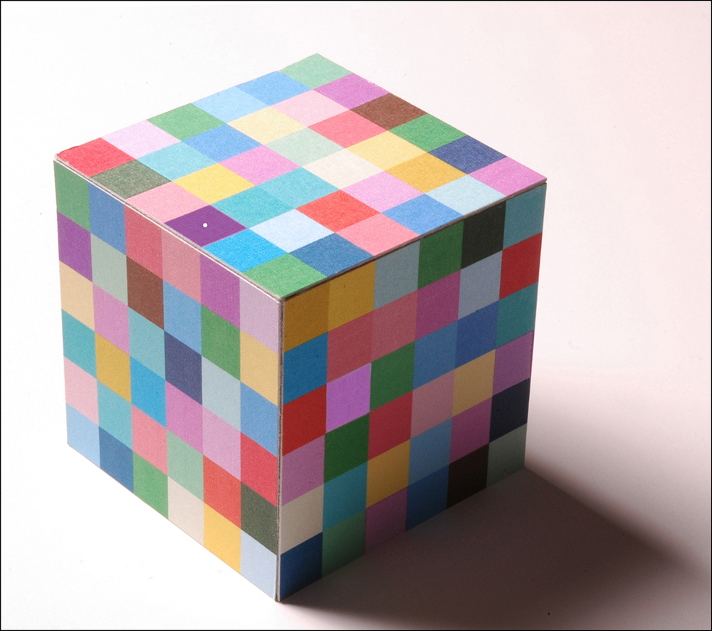
What is actually protected about this colour? That's what I'd like to know, it doesn't make sense to me. One can protect a certain pigment mixture or a process for producing a colour. One can discuss whether the application or the recipe should be protected. What cannot be protected is the experience I have. That already changes depending on the lighting. Look at this example with the multi-coloured cube. There are two surfaces in printing colours that are objectively the same but look completely different. Which colour do you want to protect now?
Regardless of production and pigment mixture, one cannot protect the pure spectral course of a colour. Everything that occurs in nature cannot be protected. I cannot protect thoughts either.
We have a similar problem in genetic research. What is not to be protected there that has long existed in nature? My position is quite clear: this is not possible.
Thank you very much for this interview, Professor Kobbert.
The questions were asked by Holger Everding.
Literature tip
Max Kobbert: The Book of Colours. wbg Theiss 2019 (2nd ed.)[:en].
Colour People Interview
Dr Andreas Kraushaar, FOGRA

Dr Andreas Kraushaar (39) is Head of the Prepress Technology Department at the Forschungsgesellschaft Druck e.V. (FOGRA). FOGRA is a non-profit institution based in Munich, which is primarily dedicated to standardisation and quality in printing processes. In addition to the „Process Standard Offset“ (PSO), the FOGRA ICC profiles are well known in print shops. Currently, for example, „FOGRA39“ can be used to convert colour into CMYK for offset printing on coated paper.
Dr Kraushaar joined FOGRA after studying media technology at Ilmenau Technical University. At the same time, he completed his doctorate at RWTH Aachen University. He is the author of numerous practical and scientific publications and played a key role in the implementation of the Process Standard Digital Printing (PSD). He has held an influential position in the field of colour from an early age - and does so with great enthusiasm.
Kraushaar comes from Eichsfeld and now lives in Munich.
Questions for Andreas Kraushaar
Mr Kraushaar, what is your favourite colour and what do you associate with it?
That's pretty mundane for me. My favourite colour is green. I had my first car painted Kawasaki green metallic. Today I'm almost ashamed of it, but it was the time, I found it very attractive and I still think it's very beautiful. Today, for example, if I'm allowed to choose game pieces, I choose green. It's also the colour of hope - I used to be an altar boy and loved wearing the green Mass vestments.
How did you get into the subject of colour?
I studied media technology in Ilmenau and came to lighting technology by chance. There I got to know Professor Dietrich Gall and his lectures. What fascinated me was that as a colour-vision deficient person, he had a very special approach to colour. On the one hand, he was fascinated by colour, but he also wanted to understand and scientifically falsify the judgements of others. So he cleverly tried to question our statements and put hurdles in front of us. I found that very exciting and interesting. Professor Gall also separated the scientific and the harmonic nature of colour very nicely. Professor Gall, who is now retired but still very active, is the reason why I am so intensively involved with colour today.

What is your task today regarding colour?
I have a certain freedom of design in the research work of FOGRA's pre-press department. That is another reason why I feel very comfortable there. I don't just work through fixed programmes, but can set my own priorities and decide for myself where the journey takes me. It is my job to have a very good command of the practical use of colour in printing, so that in seminars, exams and symposia we can strike a balance with practical use. On the one hand we have to know the programmes well so that we know how to implement it well, and on the other hand we have to communicate the procedures well. My main task is to master the practical challenges in the field of colour management, screen measurement and modelling and to present them in simple terms for the target group.

Where is the journey heading?
When it comes to image quality, colour is still a very important aspect. Colour in 3D printing is also becoming an important issue. With colour and appearance, other aspects are added to the colour itself, such as texture, gloss, surface texture and viewing angle.

What are you working on at the moment?
I am currently working on the theme of the colour of teeth. This is not only very exciting, but also the most humbling subject I have experienced so far, because there you have the challenges of opalescence, transparency, translucency and fluorescence in addition to reflection. It is the supreme discipline, I am curious to see how the project will develop.
The subject of colour is always exciting and challenging, even if I „only“ concentrate on the areas of colourimetry, colour appearance and colour differences.
What fascinates you about the topic?
It is the interdisciplinarity. We have so many approaches and so many approaches to colour! Colour harmony, ophthalmology, colour physiology, colour physics.... You can work with colour as an engineer, physicist, designer, biologist or psychologist. I am always fascinated by the beauty of colour, and the simultaneous technical view: how can I reproduce colour as accurately as possible in one way or another, how metameric is it?
Thank you very much for this interview, Dr Kraushaar.
The questions were asked by Holger Everding.
Further information
...you will find under http://www.fogra.de.[:]