After a year of development, we are going public with our largest in-house development to date: the HLC Colour Atlas.
It has been shown that our small team is a powerful force that is capable of producing good results. It can withstand discussions and knows how to use them positively. In other words: it is fun and makes you want more.
In the end, it's the result that counts, and this one doesn't need to hide from the alternatives of the manufacturers' own colour collections, because these are limited to the respective manufacturer (and usually also to a certain industry), hardly comparable with each other, often not usable on the computer, only rarely calculable in themselves ...
CIELAB/HLC as a universal colour system
Our approach is to define colours systematically on the basis of CIELAB/HLC in order to create a universal colour system. This can be used for all conceivable types of colour design on the computer. For example, in the design of logos, packaging or even entire house facades. The given number of colour tones in the digital libraries and physical references available so far (HLC Colour Atlas, HLC Colour Fan) can easily be extended if necessary, since intermediate tones follow a clear mathematical logic. In a sense, we are developing from the computer into the real world, rather than the other way around, as is the case with many colour collections. Such are often based on an arbitrary collection of colour samples, which are difficult to grasp digitally and whose colourimetric data are not made available to users at all or only to a very limited extent for high licence fees.
Cross-media support
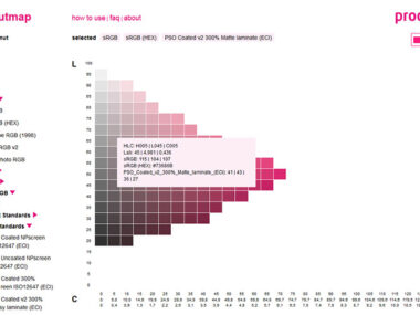
Another concern of ours is to provide aids for design in a cross-media context (keyword: "crossmedia") that clearly show the differences between the colour ranges that can be reproduced in each case. The PDF version of the HLC Colour Atlas therefore contains colour charts for sRGB (office and internet applications) and for offset printing with process colours only, in addition to the large colour gamut of the printed version, which covers additional spot colours. This allows you to check already in the design phase whether problems are to be expected in the later implementation because, for example, a logo colour cannot be reproduced accurately on websites or in print without spot colours. What is the use of selecting a bright orange from a colour fan as your corporate colour, if later on the poster or the cover of a brochure in scale printing only a significantly less saturated ochre tone is achieved or considerable additional costs arise due to an additional special colour?

We are curious about the response from the public. Are the benefits perceived, will you work with our atlas?


